

Modern industrial management demands data-driven decisions. These decisions lead to more efficiently allocated resources, which lowers waste and increases productivity gains.
When considering tools that help businesses effectuate these demands, the Pareto chart stands out. It’s lauded for its ability to help target problems with the greatest impact and deliver maximum results when addressed.
Based on the Pareto Principle-often called the “80/20 rule”- 80% of problems are caused by just 20% of the factors.
When applying the Pareto Principle to maintenance and process management, you can strategically prioritize your maintenance activities by identifying which problems will have the greatest operational impact so you can.
In this article, we’ll explore using the Pareto chart in industrial environments to optimize maintenance processes and drive operational efficiency.
What Is a Pareto Chart?
A Pareto chart is a visual tool for identifying and prioritizing the problems that have the biggest impact on a process. The insight for this chart was first developed by Italian economist and sociologist Vilfredo Pareto in the late 19th century.
When analyzing wealth distribution in society, Pareto found that 80% of Italy’s land was owned by just 20% of the population.
The underlying concept was later applied to quality control and industrial management by an Engineer, Joseph Juran, who named it the Pareto Principle and also referred to it as the 80/20 rule. In the 1940s, Juran popularized the idea after noticing that in production processes, 80% of defects were caused by only 20% of the root causes.
That insight led to Juran creating and popularizing the Pareto chart to visualize and quantify this imbalance.
In an industrial context, the Pareto Principle suggests that a small number of failures are responsible for most of the downtime and losses. The challenge is identifying them quickly and acting before they escalate into critical issues.
Another helpful way to think about this is by prioritizing the right 20% of problems, you can ensure 80% of the gains delivered through continued uptime.
The Pareto chart (and the ABC curve) enables teams to visualize this relationship by ranking problems according to their impact. This clarity reveals which factors need immediate attention and which have a marginal effect.
What Is the Purpose of a Pareto Chart?
The main function of the Pareto chart is to help managers and maintenance teams focus their efforts on solving the most critical problems instead of spreading resources across low-impact issues.
This approach ties directly to the concept of Pareto efficiency, which suggests that the best results come from eliminating waste and concentrating on the work that truly drives performance.
In practical terms, Pareto charts serve to:
- Identify and prioritize the problems that most affect productivity and quality
- Guide resource allocation toward actions that deliver the highest return
- Support decision-making by providing a clear, objective view of what to address first
- Reduce failures and waste, enabling leaner and more efficient processes

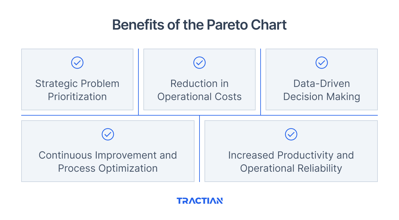
Benefits of the Pareto Chart
If 80% of production delays are caused by just 20% of equipment failures, does it make sense to treat all problems the same way?
The Pareto chart eliminates that inefficiency by ranking the causes of failure based on their true impact.
In an industrial maintenance context, this means less guesswork and more strategic action. Beyond helping eliminate equipment failures, this visual tool also offers other key benefits:
Strategic Problem Prioritization
Many companies waste valuable time trying to address every failure in a process with the same level of urgency. The Pareto chart cuts through this scattered approach by allowing teams to focus on the issues causing the most damage.
Take a maintenance department, for example. If they can determine that machine stoppages stem from a single failure mode-like poor lubrication in bearings-this insight enables them to develop a more effective and targeted action plan.
Reduction in Operational Costs
Wasted resources are one of the biggest threats to profitability. So, keeping production processes efficient demands tight cost control. Pareto charts help identify where financial losses are concentrated to eliminate waste through data-driven decisions.
If a maintenance manager realizes that most spending is tied to corrective interventions on specific machines, it makes sense to invest in predictive maintenance for those assets first.
Likewise, if 80% of excessive energy consumption comes from just a few machines, focusing corrective action on those assets leads to much higher savings than applying generic measures without clear direction.
Continuous Improvement and Process Optimization
Implementing Pareto analysis enables a structured cycle of continuous improvement. It solves isolated issues and also creates a repeatable method for identifying inefficiencies to optimize them over time.
With the right data, teams can regularly review and adjust maintenance strategies as new bottlenecks or failure patterns emerge.
Likewise, this ongoing optimization improves production predictability, helping avoid repeated breakdowns that threaten delivery schedules and final product quality.
Data-Driven Decision Making
Relying on gut feeling or subjective experience in decision-making often results in strategic missteps. The Pareto chart supports precise, eliminating guesswork and ensuring every initiative is grounded in measurable impact.
It also enhances transparency across departments. Maintenance, quality, and production teams work with a shared reference point, aligned by importance.
Increased Productivity and Operational Reliability
One of the industry's biggest challenges is keeping production running without unexpected interruptions. Unplanned downtime, quality issues, and process bottlenecks all diminish plant efficiency.
Pareto charts help reduce recurring failures, making operations more stable and predictable.
In industrial maintenance, response time is critical. Knowing which assets generate the most failures allows for targeted strategies to boost equipment reliability and reduce downtime.
Step-by-Step: How to Build a Pareto Chart
The Pareto chart is a powerful visual tool, but its effectiveness depends entirely on the quality of the data collected and analyzed.
A poorly constructed chart can lead to misguided priorities, diverting time and resources toward low-impact issues.
In industrial maintenance, using a CMMS (Computerized Maintenance Management System) streamlines this process by automatically logging failures, downtime, and recurring issues.
Below, we walk through how to build a Pareto chart specifically for equipment failure analysis, ensuring a data-driven and accurate prioritization process.
1. Data Collection
The first step is gathering reliable data on the problems affecting your operations. In maintenance, this means analyzing work orders, failure reports, and records of unplanned downtime.
Best practices for data collection:
- Use a CMMS to log all failures in a standardized format
- Define a relevant and adequate time frame for your analysis (e.g., last quarter or past 12 months)
- Capture all necessary details: failure type, downtime duration, and affected assets.
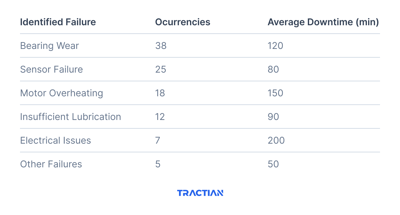
Example dataset for industrial maintenance:
2. Categorizing Failures by Type
After collecting the data, the next step is to accurately classify the failures. Poor categorization can dilute key insights and make the analysis less effective.
Best practices for classification:
- Group similar failure types to avoid excessive fragmentation
- Set clear criteria for each category (e.g., mechanical vs. electrical failures)
- Ensure each category reflects real root causes rather than symptoms that don’t identify the deeper causes.
In the earlier example, "Bearing wear" and "Insufficient lubrication" might be connected. If data shows that most bearing failures are caused by a lack of lubrication, it may make more sense to consolidate both categories. This approach improves prioritization and gives a clearer picture of what’s driving equipment failure.
3. Sorting Data in Descending Order
Once failures are categorized, organize the data from the highest to the lowest number of occurrences. The goal is to highlight which issues have the greatest operational impact.
Pro Tip: If you're analyzing downtime instead of the number of occurrences, make sure to sort by total impact on production time, not just event frequency. A single type of failure may occur less often but still cause the most lost hours.
4. Building the Pareto Chart
With your data properly sorted, it’s time to build the chart itself. A well-constructed Pareto chart will clearly highlight where your team should focus efforts to eliminate the most critical equipment failures.
Your chart should include:
- X-axis: Failure categories, ordered from highest to lowest impact in terms of frequency
- Left Y-axis: Number of occurrences (bar chart)
- Right Y-axis: Cumulative percentage (Pareto curve)
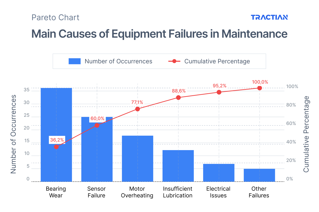
In this chart, the bars represent the number of failures by category, while the Pareto curve shows the cumulative percentage.
We can clearly see that the first three failure types account for the majority of the issues, reinforcing the logic behind the Pareto Principle. And this is a basic example. When you include more data to take into account other downtime impacts (like intervention costs), they become even more powerful.
5. Analyzing the Chart and Taking Action
With the Pareto chart in hand, interpretation becomes straightforward. The first few causes listed represent the bulk of the failure types and should be tackled as a priority.
In our example, bearing wear and sensor failures alone account for nearly 50% of all occurrences.
That means an effective action plan might include:
- Implementing predictive monitoring to detect bearing wear before it causes unexpected downtime.
- Reviewing and testing critical sensors more frequently to avoid sudden failures.
- Investing in a CMMS to ensure automatic failure logging and improved preventive maintenance planning.
How Pareto Charts Guide You Toward Eliminating Failures in Critical Assets
Eliminating failures takes more than just knowing the problems, it requires knowing where to start.
Pareto charts prove their value by pointing this out. They turn operational data into strategic clarity, showing which failures carry the most weight and where your maintenance efforts should actually be focused.
When this level of prioritization is applied to real data-failure frequency, downtime, and intervention cost-the path to reliability becomes much clearer.
Assets that used to receive equal attention can now be managed based on their criticality, enabling intelligent decisions and more strategic investments.
When this logic is connected to technology, like predictive sensors and integrated management systems, the impact multiplies. The analysis is no longer a one-time effort, but continuously feeds real-time decisions and anticipates failures before they disrupt operations.
Pareto Analysis as a Continuous Improvement Tool
Building a Pareto chart is the starting point for making data-backed decisions and powering a continuous improvement cycle.
Continuous improvement methodologies rely on Pareto analysis to guide corrective actions based on real impact.
Whether you’re using Lean, Kaizen, or Six Sigma management principles, the core idea is the same: eliminate waste and focus on what truly matters. The Pareto chart is a way to bridge the ideal to the work by showing where the biggest gains can be achieved with the least effort.
However, the true impact only comes when the improvement cycle is routinely revisited and adjusted.
In other words, once an action plan is in place, it’s essential to measure the results and periodically refactor and reassess the chart to ensure your efforts deliver real outcomes.
Here are a few ways to analyze results based on top management methodologies:
Kaizen
Kaizen is built around the concept of incremental, continuous improvement-small, consistent changes that lead to significant long-term results.
Pareto analysis complements this approach by helping teams understand which changes to prioritize for maximum impact.
For example, if a production line experiences frequent failures in specific components, analysis might reveal that 80% of the issues stem from poor part fastening during assembly.
Instead of overhauling the entire assembly process, a Kaizen plan could start by standardizing and reinforcing the fastening step. This targeted effort drives meaningful improvement without overwhelming the operation.
Lean Manufacturing
One of the core goals of Lean Manufacturing is to eliminate waste, which is anything that doesn’t add value to the final product. Waste, in this sense, can be any inefficiency, such as the steps in a process or a procedural method.
The Pareto chart supports this effort by identifying the top sources of inefficiency, so teams can address what’s draining value from their output.
Take a plant producing auto parts, for example. If rework rates are high, it might be tempting to address all the causes simultaneously. But a Pareto analysis may show that just two specific defects account for 75% of all rework.
With that insight, Lean initiatives can focus efforts precisely where they matter most, cutting material waste, reducing cycle time, and increasing process efficiency.
Six Sigma
Six Sigma focuses on reducing process variation to deliver consistent, high-quality outcomes.
In this context, Pareto analysis plays a key role-especially during the “Measure” phase of the DMAIC cycle-by revealing which factors drive the most defects or failures.
Imagine a food processing company aiming to reduce the number of out-of-spec products. Through Pareto analysis, they discover that 80% of inconsistencies are linked to fluctuations in cooking temperature.
A Six Sigma project would then investigate this variable in depth, applying controls to stabilize the process and improve final product quality and predictability.
The Feedback Loop
Creating a Pareto chart and implementing improvements doesn’t mean the problem is solved forever. Industrial processes are dynamic. Changes in machines, materials, or personnel can introduce new sources of variation.
That’s why Pareto analysis must be revisited regularly, forming part of a continuous feedback loop to keep improvement efforts aligned with operational reality.
This ongoing cycle includes:
- Initial Data Collection: Identify and categorize the most relevant failures.
- Building the Pareto Chart: Rank causes by their impact on operations.
- Action Planning: Implement improvements targeting top-priority issues.
- Monitoring and Measuring Results: Track outcomes and verify effectiveness.
- New Data Collection: Reassess the situation after a defined period.
- Chart Update: Confirm results or uncover new issues to address.
This process ensures that continuous improvement stays truly continuous. Companies that revisit Pareto analysis consistently can fine-tune their strategies and correct course before minor deviations become major problems.
How the Pareto Principle Accelerates Decision-Making
The ability to make fast, effective decisions is a competitive advantage in any industrial operation.
Resources like time, budget, and workforce are limited. How efficiently they’re allocated determines the success or failure of a project, plant, or maintenance strategy.
The Pareto Principle offers a valuable shortcut in this process. It removes guesswork by highlighting where the biggest impacts lie and which actions should be prioritized first.
Smarter Prioritization
Decision-making guided by the 80/20 rule follows a simple idea: it makes no sense to spread resources evenly across all problems when just a few cause most of the impact.
Take an operations director reviewing failure data from a production line. Without a structured approach, they could spend weeks debating minor issues that barely move the needle on productivity.
But with a Pareto analysis, they might quickly see that just three mechanical issues account for 75% of all unplanned downtime. That insight shifts the focus, eliminating wasted effort and driving faster, more effective action.
This logic applies across every level of industrial management:
- Maintenance managers reduce downtime by targeting the most recurring failure modes.
- Plant directors optimize operational costs by investing in the areas with the highest production impact.
- Project leaders use the 80/20 rule to prioritize critical activities and hit deadlines without wasted effort.
Pareto Analysis and Pareto Efficiency
Pareto efficiency, a concept introduced by economist Vilfredo Pareto, refers to a state where no resource can be reallocated without negatively affecting another outcome.
In simpler terms, it’s the point of maximum optimization, where every decision delivers impact, and any further improvement comes at a tradeoff.
In real-world operations, Pareto analysis is a critical step toward reaching that level of efficiency. By identifying the issues with the biggest operational impact, decision-makers can:
- Allocate investments where they’ll generate the highest return.
- Eliminate waste by cutting initiatives that absorb time and money without real value.
- Respond faster to crises by immediately directing attention to the most critical areas.
In industrial maintenance, for instance, the most critical assets in a plant often account for most of the repair costs and downtime.
Using Pareto logic, teams can isolate these assets and proactively manage them, avoiding cascading failures and unlocking long-term reliability.
Agile, Data-Driven Decision-Making
Companies that apply the Pareto Principle to guide their decision-making don’t waste time on guesswork or lengthy analysis. Instead, they act on real, concrete data, allowing for fast, strategic adjustments.
A practical example - A maintenance manager realizes that 80% of repair requests come from just 20% of the factory’s equipment. With that insight, they can:
- Prioritize preventive inspections and servicing for those high-risk assets
- Justify investing in predictive monitoring sensors for the most critical machines
- Reallocate the team to focus on areas where failures are more likely to occur
How Integrated Solutions Maximize the Value of Your Pareto Chart
Building a Pareto chart is a critical first step toward developing priorities and optimizing operational efforts. However, the effectiveness of this tool is critically dependent on the accuracy and reliability of the data being analyzed.
Without precise, continuously updated data, the analysis can lead to flawed decisions that waste resources and limit the impact of your improvement plans.
In settings where speed and accuracy are integral to success, combining Pareto charts with advanced monitoring and asset management solutions turns them into a dynamic, real-time decision-making engine.
Similarly, digital tools like CMMS and EAM help structure workflows, centralize failure histories, and track cost data. Yet, unlocking that next-level decision-making requires combining these systems with predictive technologies.
This is why solutions that merge smart sensors, artificial intelligence, and automated analysis are redefining how the 80/20 logic is applied throughout industrial manufacturing sectors.
Tractian operates precisely at this intersection, where AI-powered tracking and analysis meet centralized digital histories. This is why Tractian is known as an industrial copilot-it brings predictive monitoring, failure analysis, and automated maintenance management into one unified platform.
With an integrated approach, Pareto analysis becomes a living tool and a driver of proactive, high-impact decisions.